
Fonts are a subtle way to attract and retain readers. They sometimes go unnoticed but the right ones can make all the difference.
The Silent Impact of Fonts
Ever paused to consider the impact fonts have on your perception of the content you consume? It’s a subtle effect that often goes unnoticed, but it’s undeniable. Fonts play a pivotal role in shaping how we interpret and engage with text-based media.
Some fonts, like Times New Roman, Helvetica, and Arial, have become so ubiquitous that they’re practically synonymous with reading itself. These fonts, along with others like Verdana and Georgia, are among the most used fonts of all time. Their widespread usage is testament to their versatility and universal appeal.
Decoding the Anatomy of a Font
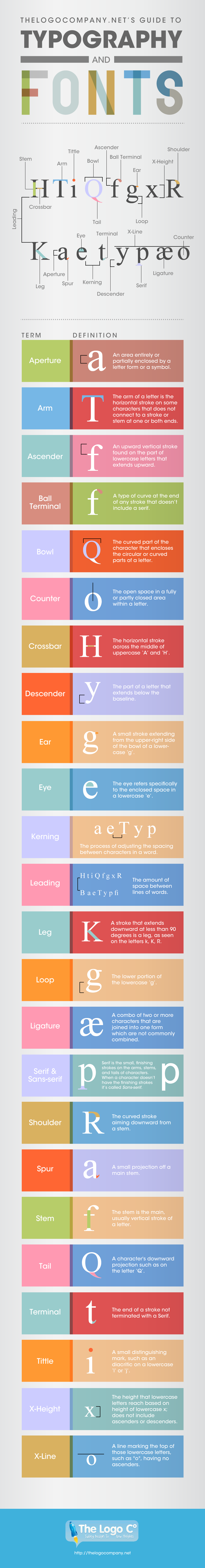
At a glance, you might think that a font is just a collection of stylized letters. However, when you delve deeper, you’ll find that each font has a unique structure comprising several key elements.
The Stem
The stem is the vertical or diagonal stroke in letters. It’s the backbone of characters like ‘l’, ‘b’, ‘d’, and ‘h’. The thickness and angle of the stem can greatly influence the overall aesthetic of the font.
The Bowl
The bowl is the rounded part of letters like ‘b’, ‘d’, ‘o’, ‘p’, and ‘q’. It’s the hollow space that gives these letters their distinctive rounded shape. A font’s bowl can be tight or loose, deep or shallow, and this subtle variation can create dramatically different visual effects.
The X-line
The x-line, also known as the x-height, refers to the height of lowercase letters. It’s the distance from the baseline of a letter to the top of lowercase characters like ‘x’. Fonts with a high x-line tend to be easier to read at smaller sizes, making them ideal for body text.
The Aperture
The aperture is the opening or gap in letters like ‘e’, ‘c’, and ‘s’. It plays a significant role in legibility, especially in smaller font sizes or when the text is viewed from a distance. A wider aperture makes a font more readable, while a narrow one can give the font a more stylized, compact look.
The Leg
Last but not least, the leg is the descending part of a letter. It’s a defining feature in characters like ‘k’, ‘R’ and ‘K’. The shape and length of the leg can lend a font its unique character–from the pronounced, angular leg of the ‘K’ in the Blackletter font, to the subtle, curved leg of the ‘k’ in Garamond.
Fonts: The Unsung Heroes
Despite their pivotal role in shaping our reading experiences, fonts often go unappreciated. However, as we’ve seen, a lot goes into designing a font. Each element–from the stem to the leg–plays a critical role in giving a font its character and readability. So the next time you’re reading something, take a moment to appreciate the silent artistry of the font.