
It’s been a helluva hot summer.
Global temperatures are on pace to be the 2nd hottest on record, even though many had expected this year to be cooler post El Nino. On the home front in the last 2 weeks Northwestern regions like Washington and Oregon have issued extreme heat warnings, and in July a 131 yr old heat record in downtown LA was broken.
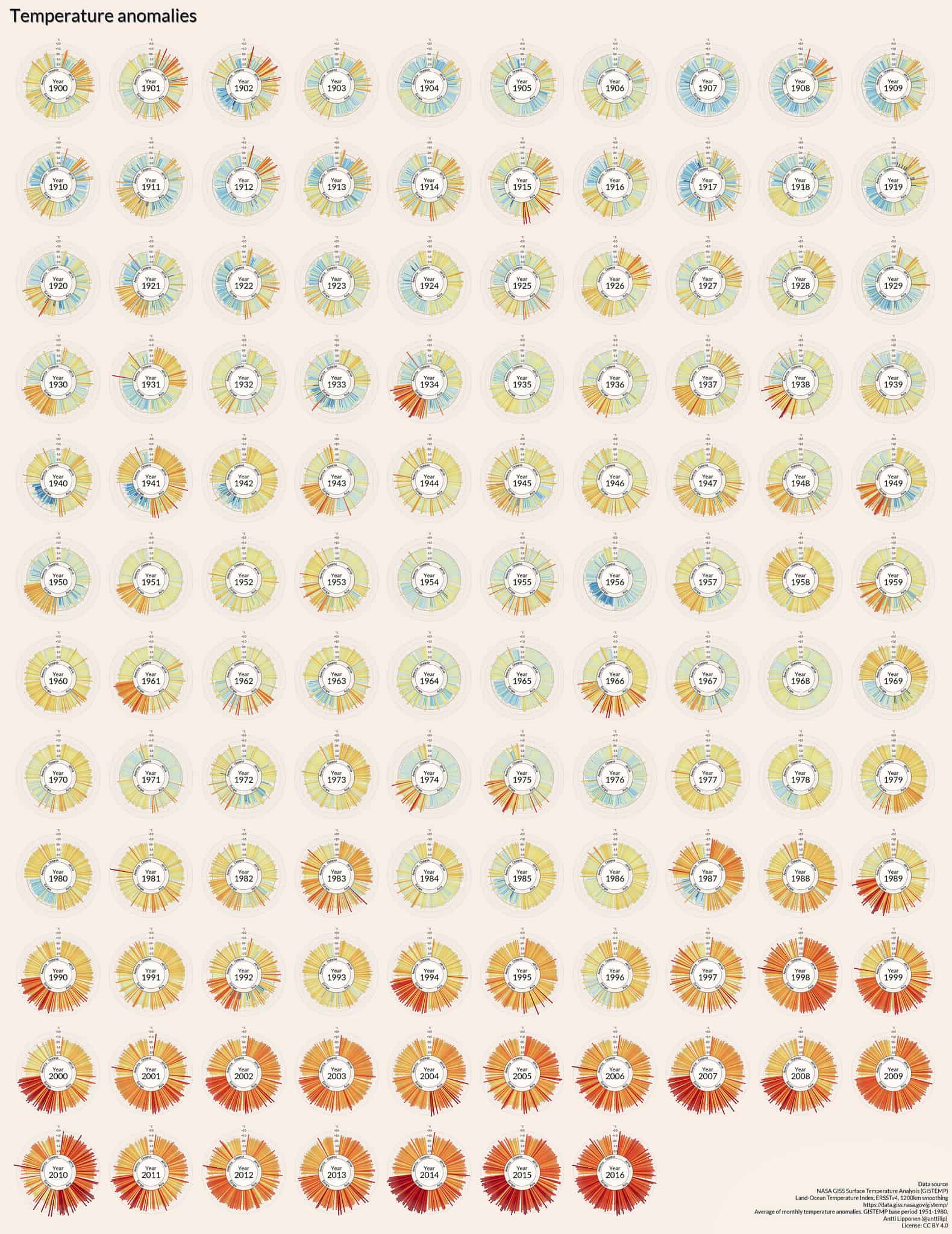
An unmistakable heat trend is highlighted by today’s 35 second video infographic, which shows the earth’s temperature anomalies over 116 years. Fascinating work by Antti Lipponen, a physicist working at the Finnish Meteorological Institute. The infographic is based on data from NASA, cleverly showing temperature variations all over the world.
Over 100 countries are shown, and the inner circle shows the region. I had to look up Oceania, which refers to the area around Australia. Blue shows cooler years and red hotter, with color intensity notably increasing over time.
The spiral shows temperature variations within 2 degrees celsius, which was the line in the sand the Paris agreement wanted to draw. We are expected to exceed a 1.5 degrees C increase in 15 years. A 2 degrees C change in temperature would threaten food, shelter, energy, and health around the world.
Much of our carbon usage in the form of energy usage or waste gets trapped in the atmosphere, contributing to global warming. We can do our part to affect change, whether it is recycling that Starbucks cup or turning off the light in the room you are leaving, every little bit adds up.