
If you’ve been keeping up with the trends then you’ve probably moved on from Vaporwave and have started listening to Beach Goth by this point. If not you’re probably very confused, maybe even angry that people are coining such ridiculous names and you’ve only just now started listening to Witch House (c’mon it’s 2014 get with the times).
With people exclaiming “Punk is dead!” while being nostalgic for the “real hip-hop” they weren’t even around for, it’s easy to see why someone would get the impression that this is all very silly and pointless. So what is the point? Well there’s the notion that these labels help describe the music, but even that has a tendency to fall short and totally give someone a wrong impression of an artist before they ever get the chance to listen to them.
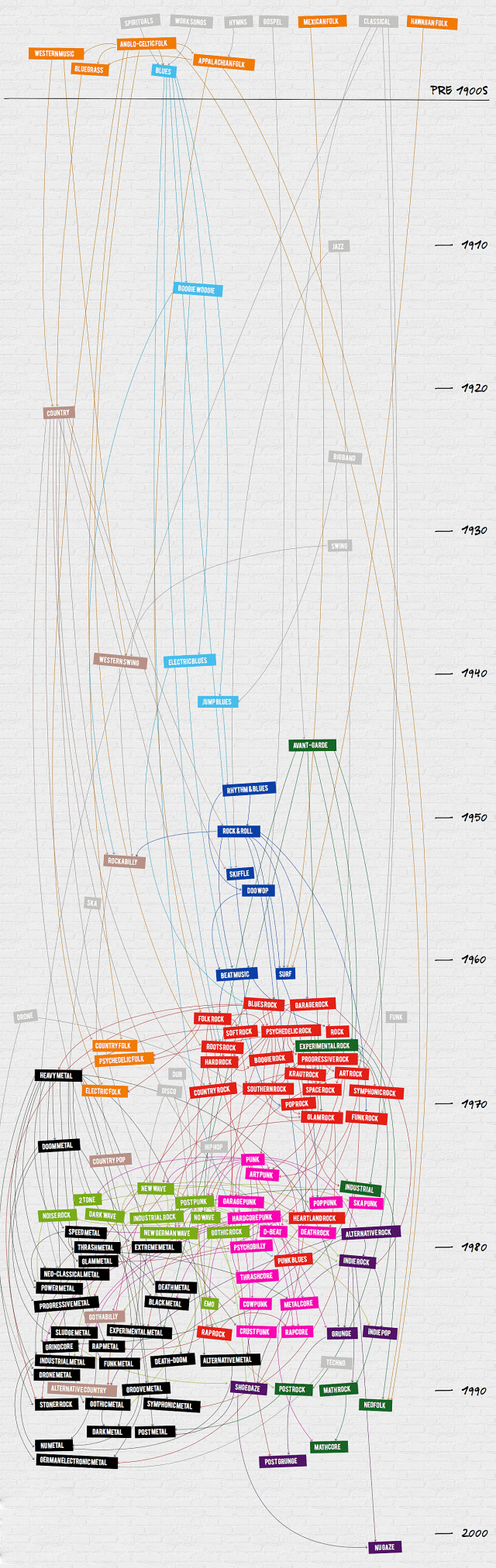
As demonstrated by this infographic, at least one saving grace of genre labels is their use in archiving music history. That way we can look back and have a word like “Disco” to call those simultaneously awful/amazing things that were happening in the 80’s. Notice the gap of new genre’s approaching the 2000’s. It’s not because there weren’t any. Just give it some more time for the critics and journalists to agree on what was good, what was not, and what to call it.
Be sure to click the link below for the full sized interactive version.