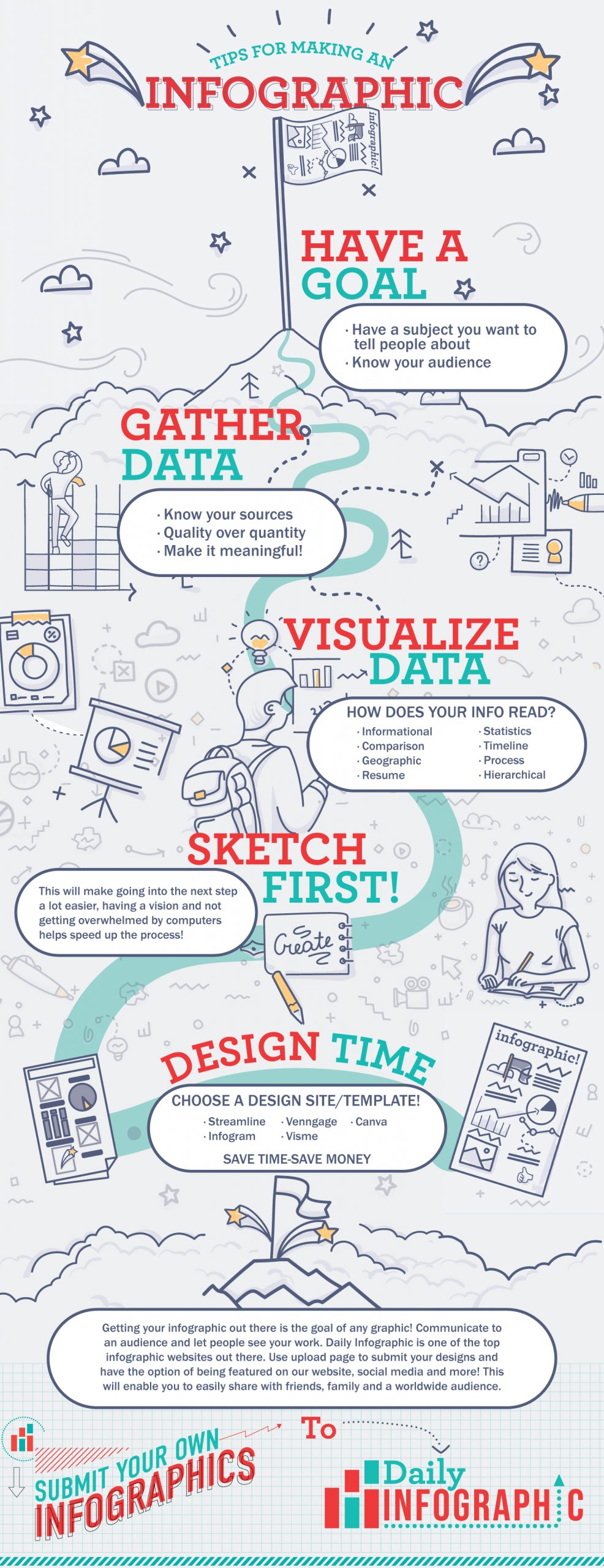

A good infographic should engage, inform, and summarize information for your audience. However, there is a fine line between designing a helpful infographic and an overwhelming one, especially if it’s your first time making one. If you are just starting to learn about creating infographics, then you’re in the right place!
This post will give you beginner-friendly steps on how to make an infographic that is compelling in no time at all.

Try these recommended sites for making an infographic utilizing easy to use templates and icons:
Canva – Canva is one of the most popular graphic design sites in the world. They have a huge library of templates and design ideas you can use. Even if your design skills are limited, you can create beautiful graphics using Canva.
Venngage – Venngage is more specialized in data visualization, where other options are general design tools. Use Venngage if you are looking to create professional looking data visualizations with very little design experience.
Infogram – Infogram has a large library of infographic templates and is a good choice if you plan on utilizing their designs for your data. Their templates are best for statistical data.
Visme – Visme offers infographic templates as well as stylized blocks that you can mix and match to suit your design and data needs.
Streamline – Streamline is a good additional resource if you need unique icons or emojis for your infographic. It’s not the best for designing something from the ground up, but is a nice addition to these other tools.
How to Make an Infographic
The assumption that only designers can create good infographics for data visualization is misleading. If you are a non-designer looking to create your own infographic, follow the straightforward guide below to learn exactly how to make an infographic even if you have no experience.

Step1: Have a Goal
The first step to creating a good infographic is identifying your target audience. If you do not get this right, you will be tempted to create an infographic for everyone, and you will more than likely end up reaching no one.
A clear picture of your target audience helps you find the right data, language, and style for your infographic. If you are struggling to define your audience, answer the questions below:
Are you targeting an internal or external audience?
If you are targeting an internal audience, like a portion of the company for which you work, you do not have to explain the basics; otherwise, the information will be overwhelming. On the other hand, if you are looking to inform an external audience, like laypeople or those just getting introduced to your industry, you have to give them background information before getting into the details.
Position of your audience
If you’re making an infographic for an internal audience, the style and language used in the infographic will often change with the ranking and position of your readers.
For instance, it is safe to lean towards an informal style when trying to reach the subordinate staff of an organization. However, your infographic should be more strategic, formal, and succinct if you are targeting the management.
Level of knowledge of your audience
The level of education and knowledge of your audience determines the language and level of visualization you are going to use. If you use medical jargon in an infographic meant for casual readers, you will have failed them and will quickly lose their attention. Simple information with visual representations will work best for them.
On the other hand, if you are targeting experts, it will be safe to use jargon and terminologies in the field, and you might be able to use more complex graphics that they will understand.
Step 2: Understand Why You Want an Infographic
After getting the target audience right, the next step to a successful infographic is determining your goals. What do you want to achieve? Do you want to educate? Entertain? Or report data from a survey? Without a clear goal, your infographic will lose focus.
On the other hand, with a clear goal of what you want to achieve, you will choose the right infographic design, style, language, and tone. This enables you to lay out the information in a way that your audience will relate to and benefit from.
For instance, let us assume you want to explain how clothes are priced. Take your audience through all the steps of making a cotton dress, for example. After that, state how companies acquire the clothes at a wholesale price from the manufacturer and mark up the price to make profits.
Keep the minute details to a minimum if you’re looking to explain a broad category, and keep overarching ideas to a minimum if you’re looking to explain a very specific topic.

Step 3: Collect and Compile Your Data
Now that you are aware of what you want to achieve with your infographic, it is time to gather the information that will help you reach your goal. Meaningful information is the foundation of a good infographic. Unfortunately, many people struggle with this step. So, what are the sources of quality infographic data?
If you are working on infographic creation for your company, the data you need can often be collected internally. But, always ensure to seek permission to access the kind of data you want.
On the other hand, if you are working on a stand-alone infographic or one for use outside of a company, you will have to dig into external sources for the information you need. In this case, ensure to use credible data sources and save them. It’s best to search on “.gov” or “.edu” sites for accurate and reliable data rather than relying on a casual blog post on the internet. You can always use a related blog post to back up information if needed.
What’s more, when collecting data, ensure that you concentrate on quality over quantity. Bombarding your infographic with a lot of information will confuse your readers, and they will end up leaving the page quickly. The goal is to collect data that is easy to digest. Your readers should be able to understand your data at first glance.
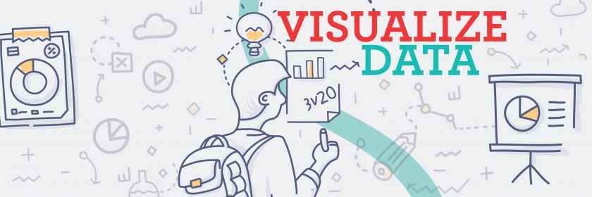
Step 4: What Infographic Suits You Best?
The structure and design of your infographic play a significant role in how the message is relayed. To accommodate different types of information, there are various infographic layouts you can choose from. So, what are infographic layouts?
An infographic layout is defined as the arrangement of content and visual elements for an infographic. In simple terms, it is how your content is placed, sized, and spaced on the infographic.
An infographic tells a story, and for your audience to relate and understand your message, you must choose a layout that best suits the topic of your story. To determine the best layout, you must be clear on what you want to achieve with your story.
What is your goal? Do you want to compare topics? Visualize a lengthy article? Or give a procedure? Understanding what you will be talking about and what you want to achieve with the infographic makes it easy to choose the proper structure.
The layout you choose should capture the focus and attention of the reader and allow them to follow to the end. To achieve this, your story must match the infographic type you choose.
To help you make the right selection, let us discuss the different types of infographic layouts.
There are nine different types, which we will discuss below.
Statistical Infographics
Statistical infographics focus on data. It uses excellent graphics to relay survey results, support an argument with an appropriate data point, or visualize data from a survey. This layout enables you to transform your data into a story by use of charts, images, fonts, and icons. To create a successful statistical infographic:
- Let the story behind your data reflect the infographic design
- Use varied data visualizations to represent data. For example, you can combine pie charts and icons or colorful visuals and bold fonts
- Emphasize key statistics by use of creative designs. For example, you can use contrasting colors or bold fonts on key data
- Use a descriptive title that helps in the interpretation of the data
Timeline Infographics
Timeline infographics visualize something that has happened throughout history or tell a story of what happened in the past and point out important dates. This type of infographic should take your audience on an interesting journey, and it is effective if the user comes with you to the end.
Human beings are spatial; we often process information through a visual representation in mind. Therefore, for your timeline infographic to create a clear picture in the mind of your users, use visual aids like photos, lines, labels, and icons to highlight important points in time.
For example, you can use large bold fonts to emphasize important dates. Also, you can use a color gradient to show progression in time. The goal is to capture your audience’s attention along the timeline and maintain that attention through to the end. The practices below will help you create an attractive timeline infographic design:
- Connect points in time using a central line
- Employ unique fonts or bold to mark the years or to highlight important events
- Use icons to illustrate different points in time
- Provide brief descriptions to make it more interesting when necessary
Process Infographics
Also known as flowcharts, process infographics provide information streams; they best outline the steps in a process. The infographic design process is simple and often intuitive for most people.
The templates can take a top to bottom flow, left to right flow, or you can number the steps. Also, use directional cues like lines, arrows, or custom shapes to direct the readers in one direction.
What’s more, you can use different colors for the headings in each step. Last but not least, if your topic has too many steps, a snake layout that takes the S-shape or a circular layout with an O-shape will help you save on space and get the many steps to fit in one infographic.
Informational Infographics
Informational infographics usually help to communicate concepts or give a summary of topics. It is made of two sections; a descriptive head and an illustrative icon. The best informational infographics have numbers on the title. Numbering the titles gives the infographic an easily readable flow. To get the best out of an informational infographic, follow the tips below:
- Create a descriptive title for each section for clarity
- Number the titles to create a flow
- Alternate the colors, direction cues and visuals to capture the readers’ attention and keep them engaged
- Use images and icons to make illustrations
Comparison Infographics
Comparison infographics are designed to give unbiased comparisons to help users decide between two options. There are many ways to compare options and make readers choose one over the other, but comparison infographics are often the best way to achieve this.
The design of comparison infographics visualizes comparison because it is split in the middle either vertically or horizontally with the options you are comparing on each side. For easy comparison, the related specs of the items you are comparing are better listed in the middle.
To differentiate between the options, use contrasting colors. You can intentionally use a bright color on the side of the item you are pushing, if you plan on suggesting one over the other.
If you have more than two items to compare, you can still do so using comparison infographics. In this case, divide your infographic into multiple columns to fit your options. Comparison spaces — like in the middle of a venn diagram — won’t be as useful in this case.
Geographic Infographics
Infographics have templates to visualize different data types, and geographic data is no exception. If you wonder how to visualize any form of location or geographic-based data, geographic infographics are very likely the best option for an easily understandable infographic.
This infographic style uses map charts for visualization, and it features different types of map charts to cater to different kinds of geographic data. To get the most out of the geographic infographic:
- Use heat maps to visualize data that should appear in order of importance or show the population density of different areas
- Use map series to compare regional data or highlight changes in different locations over time
- Use labels and icons to identify locations on the map for easier understanding
Hierarchical Infographics
As the name suggests, hierarchical infographics organize data in order of importance from the greatest to the least. Maslow’s hierarchy is a famous representation of the hierarchy of human needs. The pyramid used for easy visualization is an excellent example of an hierarchical infographic.
If you have a lot of hierarchical data, you can use the pyramid chart design to visualize, with the most critical information at the base and the least important at the top. You can also swap the positions depending on your data — just make sure your intent is clear!
What’s more, if you want to visualize hierarchical data that is broken down or following a chain of command, it is best to use a flow chart. Hierarchical infographics are easy to design, often with no skill or experience needed.
Resume Infographics
Resume infographics have continued to gain popularity over the years as job seekers look for ways to stand out in the saturated job market. Traditional resumes remain relevant and recognized by many organizations. However, infographic resume designs make the document more attractive when represented during an interview or uploaded on portfolio sites.
Although resume infographics are attractive, they remain official because they use minimal color —black or gray in most cases — and straightforward icons.
What’s more, resume infographics allow you to create an attractive header that shows skills and experience. You can also add decorative borders to represent your brand and personality. For instance, a candidate applying for a customer service position can use a leafy border to symbolize a calm and friendly personality.
List Infographics
List infographics allow you to share whatever information you have in list form in a way that is not quite as basic as a straightforward list. List infographics give you access to icons, colors, and fonts to replace the bullets. A list with color and unique fonts catches the reader’s eye and maintains focus to the end. You can number the lists to create a convenient and easily understandable flow.
You can also get creative and replace the top-bottom layout used in all listicles with a list infographic that does not follow a chronological order but has different background colors to distinguish the points.
The goal is to lay out your points in a creative manner, which catches the reader’s eye and motivates them to read through all of the information.
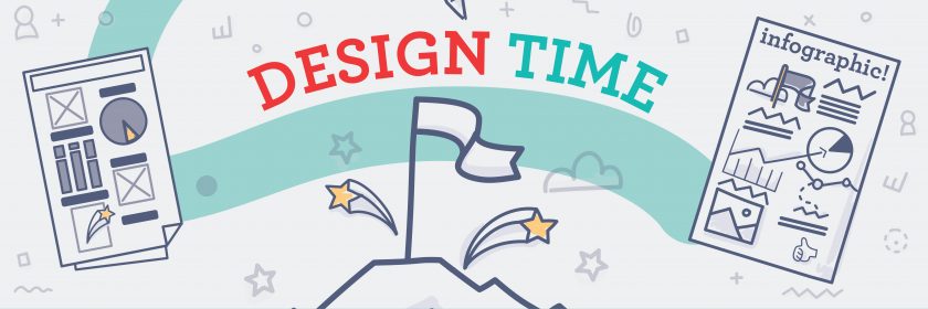
Step 5: Make It Easy With a Template!
The message in an infographic determines its success, but a bad design can ruin it for you. Therefore, choosing an infographic template that matches the story you want to tell is essential.
On the same note, if you are not a designer, refrain from the temptation to design an infographic from scratch. It’s safer to work with templates from seasoned designers than to come up with a design that is good in your eyes but a mess in the readers’ eyes.
Use the time and energy you would have used to work on an infographic from scratch to customize the many available templates online to meet your needs. All you have to do is copy and paste, change colors, move parts up and down, and change fonts.
Creating an infographic using already available templates is beneficial because they are easy to use and affordable. They almost always cost significantly less than hiring a graphic designer, and they save you time and energy over doing the work yourself.
If you are struggling to get a good infographic template, check the sites below for a variety of templates:
Streamline
Streamline provides thousands of emoji’s, icons, and illustrations for your infographic. Some of the tools are available for free. Also, they are easy to use for both beginners and seasoned graphic designers. The illustrations on this site are made of vector graphics, making them easy to customize while maintaining the quality.
Pros
- Provides a variety of icons and illustrations for an outstanding infographic
- Offers a free trial version for beginners to learn how to make an infographic
Cons
- Some tools are only available in the premium and paid version
Infogram
Infogram provides multiple templates to create infographics. It features powerful data visualization features that allow you to create infographics even from very complex data. The templates are differentiated by color. Therefore, it will be easy for you to choose the best template for your story.
After deciding on the template, you can add elements like photos, texts, colors, and fonts, and you can even add complex elements like audio and videos.
Note that Infogram templates are best for statistics data. If your infographic requires you to add numbers to maps or graphs, use templates from this site for an easy solution.
Pros
- Features a free plan
- Easy to use
- Allows you to create infographics in a few minutes
Cons
- The free version has very few templates
Canva
Canva is a powerful infographic maker, enabling you to create wonderful designs even if you are not a graphic designer. The free version has a helpful infographic template library, and this way, you can create various infographics depending on your needs.
What’s more, working on the templates is easy, and they feature the drag and drop design for easy editing.
Upon deciding on the template you want to use, Canva provides you with a library of free and for-purchase elements.
Pros
- Many templates on the free version
- Easy to use
- Creating an infographic using Canva takes just 30 minutes on average
- Tools are offered at affordable prices
Cons
- Overuse of designs because they are available for free
- You have to pay for premium templates and elements
Venngage
Venngage provides multiple infographic templates, and the good news is, the templates are designed for different types of infographics from statistical, comparison, geographic, resume, timeline, and process templates.
Creating infographics using Venngage is very easy because the templates are already sorted for you. After selecting the best template for your topic, customizing it is super simple. Venngage offers you widgets and elements based on the data and information you have.
Pros
- Offers templates categorized by types of infographics
- The templates are easy to use and customize
- When you sign up for the first time, you will be taken on a tour on how to select templates and elements, which is excellent for beginners
- Free plan for students
Cons
- Non-students have to pay to access the site
Visme
Visme does not only offer infographic templates but also offers stylized blocks and premade blocks to simplify the design work. With this site, learning some graphic design and how to make an infographic is no longer a hard nut to crack and allows you to keep up with infographic trends. As with many other graphic design sites, some templates are free, and others can only be accessed using a premium account.
Pros
- Provides premade sections and blocks, which are easy to use in the infographic
- The free plan has many templates
- Templates are easy to use
Cons
- You must pay for some good templates
Step 6: Embed Your Infographic
Once your infographic is made and you’re satisfied with how it looks and reads, it is time to embed it on your website. If you are using WordPress, follow the simple guide below to embed:
- Go to share on the template site and make the infographic public
- Click on “view embed code” and copy the code
- Paste the URL into the content area but in the HTML block on word-press. Also, ensure that the URL appears in its line
- WordPress will magically show your infographic
Wrapping Up
If you have been wondering how to make an infographic, the six steps above should help you start creating eye-popping infographics in no time at all, even if you have no experience. Remember, as much as the design plays a significant role in the success of an infographic, the content matters more. Focusing on both aspects will help you deliver the best possible content to your readers.
It is okay to switch the colors, use creative fonts, and include icons, but try not to overdo the design; otherwise, the infographic will get too busy and your audience will not understand the message. Keep it simple, and remember that less is more when it comes to visual data.