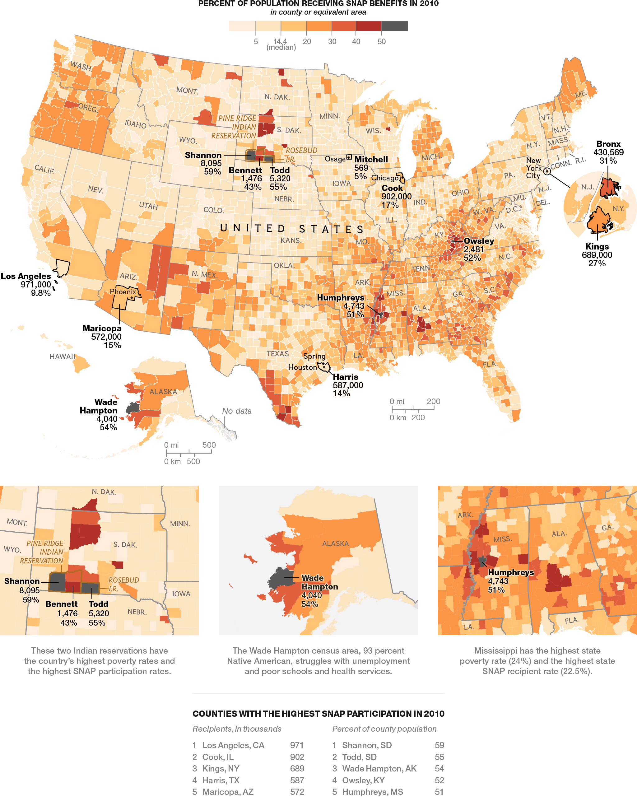

Looking at maps can tell you a lot about a country- how people are distributed, or where population growth is concentrated, for example. One of the starkest visuals, though, is a map of hunger and poverty across the United States, as illustrated by SNAP benefits usage.
SNAP, or the Supplemental Nutrition Assistance Program, is the largest federal nutrition assistance program in the United States. Simply put, it provides a monthly supplement for eligible individuals to use on food and groceries, in an effort to combat hunger. Thus, looking at this map of SNAP usage across America offers a good snapshot of poverty and hunger levels across the country.
Regionally speaking, there aren’t too many surprises: as with many other poverty indicators, the greatest hardship is concentrated across Appalachia, the south and southwest, and the Pacific northwest. Other concentrations of hunger occur in urban city centers, such as Cook County, IL, which surrounds Chicago.
However, in Cook County, which encompasses both wealthy and struggling parts of Chicago, 17% of residents use SNAP, while in Shannon, South Dakota, 59% of the population uses food stamps. These numbers suggest that urban poverty may be more localized, confined to small neighborhoods, while rural poverty spreads out over entire states and regions. Either way, seeing the geographical scope of hunger is a necessary first step in order to find solutions that work.